Leveraging Visual Content to Elevate Your Marketing Strategy
Last updated on Saturday, October 7, 2023
Marketers are turning to visuals to elevate their strategy, and why not. Visuals are easy to perceive and leave a longer impression on users. You know it's true when you see people watching back-to-back reels for hours, that too without sound.
Engaging visual content can alter how your users perceive your brand. It is not a coincidence that tech giants across the globe are experimenting with reels. Even before reels were a thing, brands like Pinterest had already created rage through engaging boards that were visually rich and full of amazing content.
Fast-forward to the present date — Brands are gearing up to invest heavily in generative AI to create visuals that will drive their marketing strategy.
With the rise of social media, brands have no alternative but to include visual content in their marketing strategy.
And it is not just static images.
The Power of Visual Content in Marketing
You want to create a brand recall with your marketing campaigns, and visuals are a great way to do that. In fact, marketers are more positive about visuals triggering better conversions than ever.
The power of visual content lies in doing it correctly. If you are not telling a story that will resonate with your target audience, you negate the entire reason for creating visuals. Whether you are using static images, infographics, or a reel — it must have a story, some facts, and useful information to tell your users.
Storytelling is a great way to communicate your message to your users. It not just creates emotional stimulation but also helps create a user-brand relationship that is long-term. Good visuals can turn your users into your brand evangelists, which is the biggest win for any brand.
For instance, if you follow Figma’s LinkedIn Page, you will see small how-to videos and images on new features that are visual guides to using the tools. For instance, this guide shows how to create glossy icons on Figma.
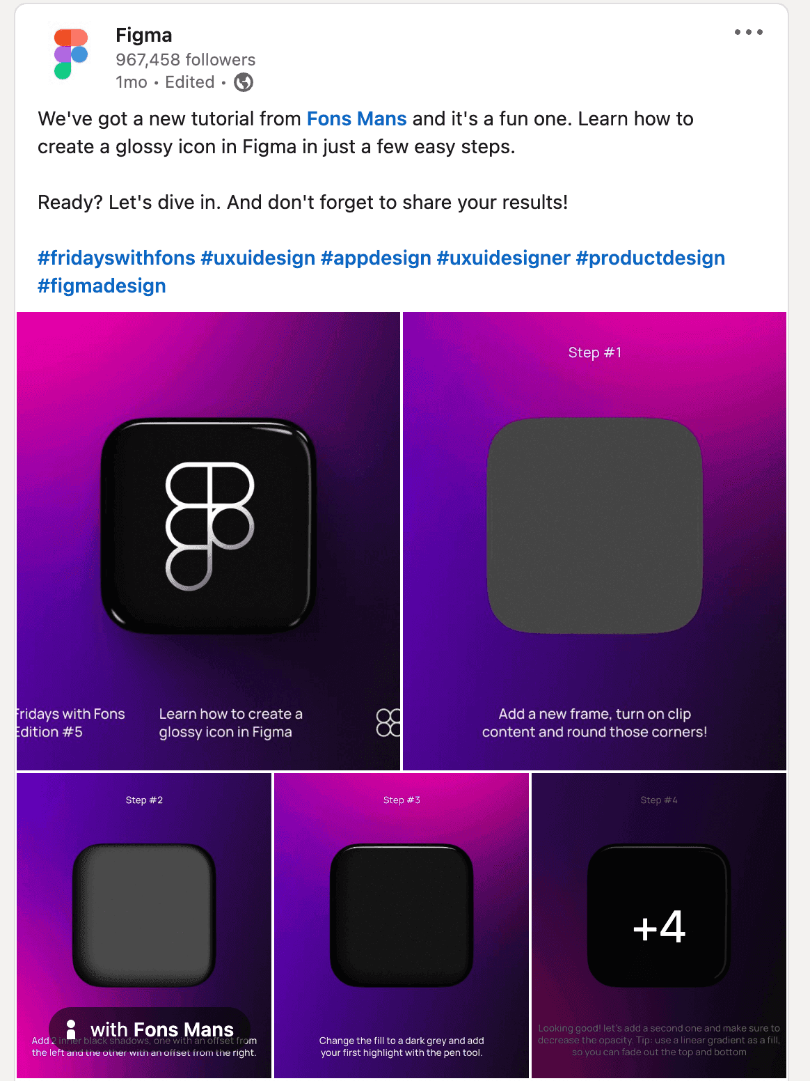
There are many instances where they share videos of their users creating amazing graphics using the tool.

Source: Figma’s LinkedIn Page
Three things are happening here -
Users are learning to use a particular feature in real-time
Users are continuously coming back to these videos when using the features
New users are amazed at the tool's possibilities and start trying it out.
So, you get engagement, retention, returning users, and new users.
Are images and videos the only type of visual content?
While images and videos do sum up every form of visual content that marketers use, the different forms of visual content include:
ebooks
Motion graphics
Infographics
Explainer videos
Data visualization
Annual reports
Landing pages
Visual CTA
Memes
Product screenshots
GIFs
Illustrations and comics
PPTs; and more
Tips for Using Visual Content in Marketing
Research shows that the human brain can process an image almost 60,000 times faster than text, and 90% of the information it processes is visual. Putting this metric into your marketing — most of your copy gets ignored. Your users will always prefer to look at cute puppy videos than read about the growing stages of a puppy.
After all, the information conveyed through visuals is retained longer. In a nutshell, 20% of what you market gets read, and 20% of that 20% is retained. Phew!
Visuals are capable of driving traffic. But you must do it. Marketers need help to strike the right balance between visuals and content, making it more challenging.
Below are a few tips (tried and tested) that you should incorporate while designing your next visual content.
Build a story with visuals
Your target users want to know your story in a way that can capture their attention span. As a marketer, you want to tell a story that:
Connects with your audience
Gives all the information quickly
Triggers engagement
Leaves a lasting impact
When creating your marketing strategy, you must plan your visuals that can do all four things listed above, much like Walmart Yard Management System (YMS) has done with this whiteboard explainer video.
This 2-minute and 25 seconds video might come across as long, but the animations syncing and narration give a cohesive guide for anyone looking to understand how the system works.
It talks about the pain points the system is solving and shows exactly how. It is a story built to explain the exact use case the brand banks upon.
This a classic example of convincing new viewers to go ahead and explore the system because it talks about the problem statement (resonates with target users) and the solution (exactly what users are looking for). Bingo!
Align your visuals with your marketing strategy
This is a giver. Your visuals and marketing ideas should sync. When creating the copy for your marketing campaign, your visual must align with it. Not just with the copy, your visuals must align with your brand identity (colors, website copy, landing pages, social channels) and extend your value proposition (the unique proposition that your brand offers).
What does this mean?
Let’s take an example.
You have started a clothing brand known for its linen material and pastel shades. Your next marketing campaign is about the summer colors, but your marketing visuals give a Thanksgiving and Christmas vibe. Additionally, you use random taglines that are not your brand’s trademark.
While your visual might look beautiful in silos, it does not fit your brand nor serves your purpose of showcasing your new summer collection.
Such inconsistencies break the user-brand relationship, and you waste dollars with zero ROI.
Balance the emotions in your visuals
Visuals can evoke emotions, and marketers want to achieve that. But overdoing emotions or being insensitive can jeopardize your marketing campaigns.
Your visual content should influence your audience's mood and perception. This is done through various colors, shapes, fancy fonts, and illustrations that you use. From balancing the design elements to creating a coherent visual and equivocal messaging - visuals and emotions go hand-in-hand.
One brand that got this on point is Yeti. Yeti's short films inspire adventure better than any outdoor brand in such a way that the brand evokes a specific feeling in its customers. The films perfectly sync with the brand's laidback yet active identity.
Be precise about your marketing goals
Emotions are not enough to convince your audience. You must tie your visual content with your marketing end goals. Your visual content should positively impact your marketing goals — increasing brand awareness, building a social media presence, or converting new unique users to leads.
How do you do it?
It always starts with documenting your visual content creation process. It makes sense — you note your marketing goals, metrics to measure your success/failure, and how you will leverage your content and visuals.
This helps you work towards a goal without getting distracted in the long run.
A structured attempt helps you fall back to rules when thinking visually. When your brand has a do's and don't's list of how visuals can be used, your entire visual content strategy aligns with your business goals, vision, and user intent.
Incorporate texts into visual content marketing
Are visual content applicable only to innovative products or outdoor brands? Nope.
Even in a text-based industry, visual content can propel your marketing strategy like never before. The living proofs are magazines that have nailed visual content like a pro.
The catch?
Incorporating texts into images that promote a story.
For instance, The New York Times has a perfectly balanced image-to-text. The Instagram post consists of images from Prague that will make you want to visit the city soon. And simultaneously, you have the caption setting up the context on how to spend 36 hours in Prague (i.e., urging you to read the recommendation list on their travel site).
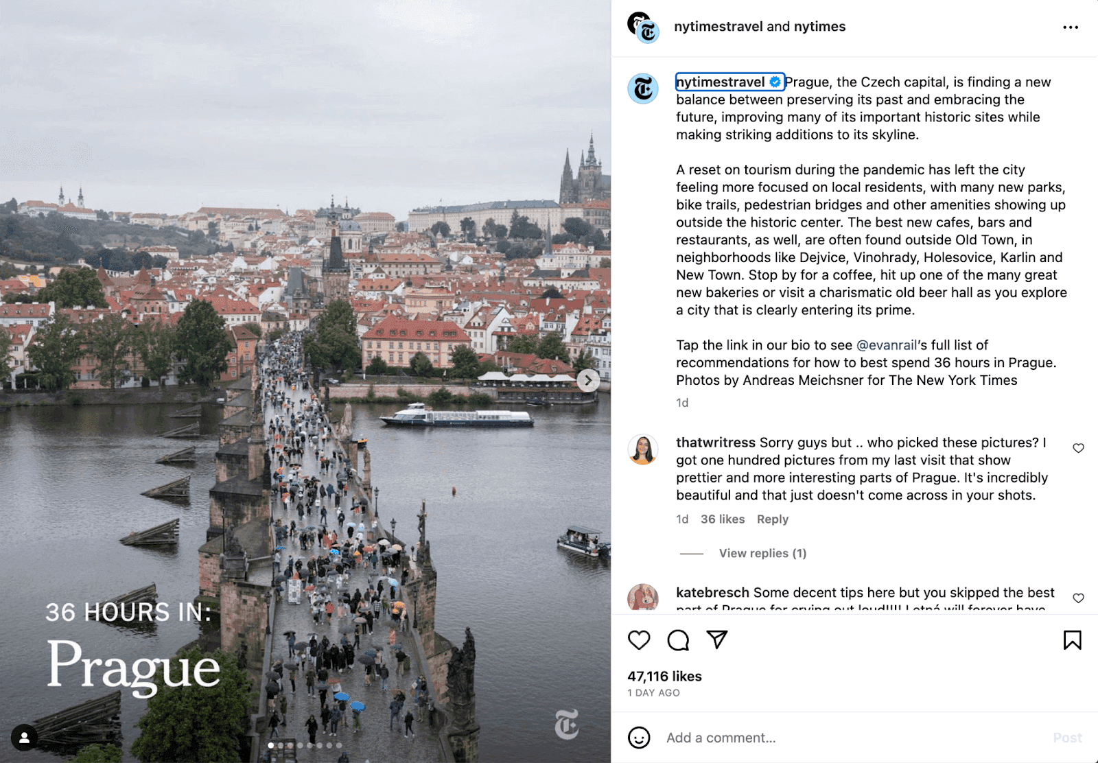
Source: NYTimes Instagram
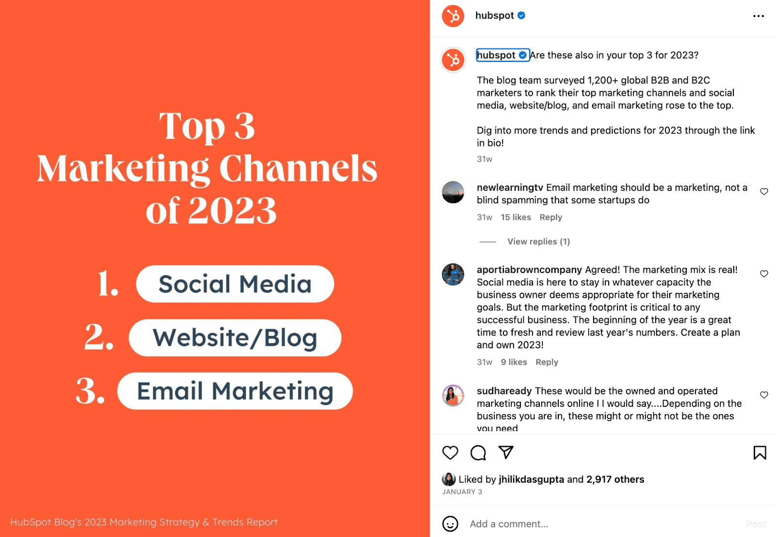
While text and images are a great combination, you can have only text as an image and still engage your users. Look at how Hubspot marketed its recent Marketing Strategy and Trends report with this text-only visual. Three tips, and you know you want to dig in to find out what else the numbers are saying.
Create a consistent color palette for your visual content
Color palettes have a significant role in visual content. You can be innovative with your visuals, but using random colors will confuse your users.
Every brand should have a color palette to follow. This has two aspects:
The brand color - This is your brand’s signature color. Whether you explicitly mention your brand name, tagline or make a logo, this signature color will help your users recognize your brand immediately. For instance, Cadbury’s Purple color or Coca-cola’s red color. These brands are known for their color. It is not a random pick, but much thought goes into creating a powerful brand color.
Marketing color palette - This color palette is your swatch incorporating your signature brand color with associated colors that will drive your visual content. This palette is consistent across all marketing visuals — social posts, infographics, ebooks, videos, illustrations, reels, etc. It helps build brand consistency and also delivers the brand recall factor.
Set a fixed swatch that reflects your brand’s identity and helps your users associate with it easily. Your visual content becomes an extension of this swatch.
Include user-generated content in your marketing strategy
Your marketing strategy is designed for your users, and using your users’ content to drive engagement rate is proven. Include user-generated content with proper credit and see your visual content marketing reaching an all-time high. It enhances your brand and positions you as a go-to name for your users. If any brand has done this best, it's Apple with its #ShotOnIphone Campaign.
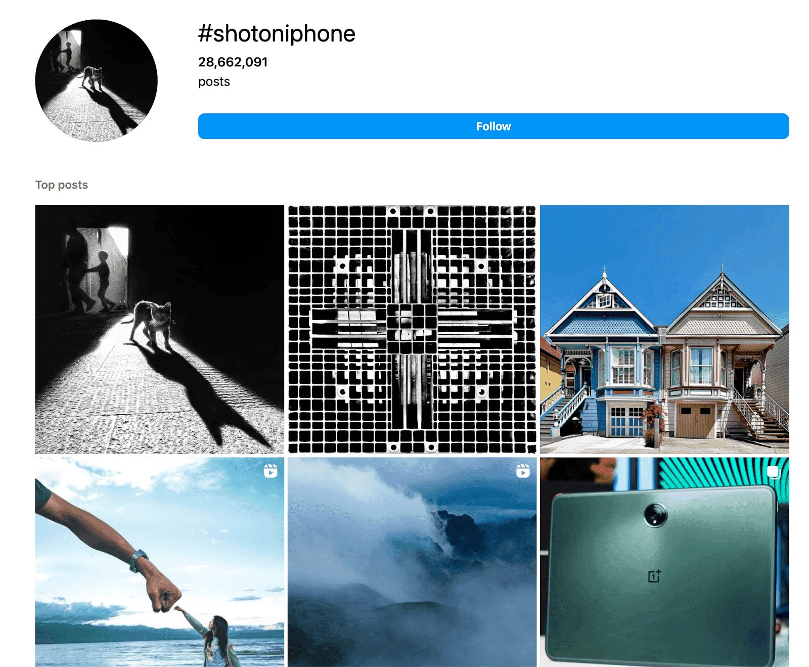
Source: Instagram — #shotoniphone
Build to repurpose
This applies to any marketing asset you create. Repurposing your marketing assets is a cost-effective and time-saving tip. When you create visual content, use design elements that can be used with various texts. For instance, you can have a template for reports which you can repurpose and use every time a new report goes live.
Design to fit
Innovation is great, but it should come with flexibility. Create visuals that are adaptable across multiple social channels. For instance, an infographic on a website can be split into a carousel to share on LinkedIn or Instagram.
Have a dedicated checklist for your visuals
No marketing strategy is complete without a checklist to ensure you are on track (and consistent at it). To leverage visual content for your marketing strategy, your ideal checklist should include the following:
- Use high-quality images
- Be aware of copyright, especially when including user-generated content
- Add your brand logo or watermark where appropriate
- Add a hook to your visuals to make it engaging
- Maintain color swatch
- Make a budget
- Create a plan or timeline
- Research for hashtags
- Optimize visuals for SEO (like including alt-text descriptions)
- Monitor trends This should be a good list to start off.
Closing thoughts
Marketers are diligently incorporating visual content in their marketing strategy. While this is the need of the hour, it is also important not to lose focus.
Since human attention span is limited (and little), experts recommend keeping videos short and images clutter-free.
Your goal is to give information to your users without being insensitive, cliche, and distracted. So, focus on the visual appeal and story you are telling, align it with your brand identity, and connect with your users emotionally. The rest will follow suit.

Article by:
Mehdi Hussen
Organic Growth Consultant
Mehdi Hussen is a SaaS marketing and organic growth consultant. He helps SaaS businesses drive organic growth and customer acquisition through SEO and data-driven content marketing strategies. Mehdi spends his spare time musing about startup growth strategies, personal productivity, and remote work.
