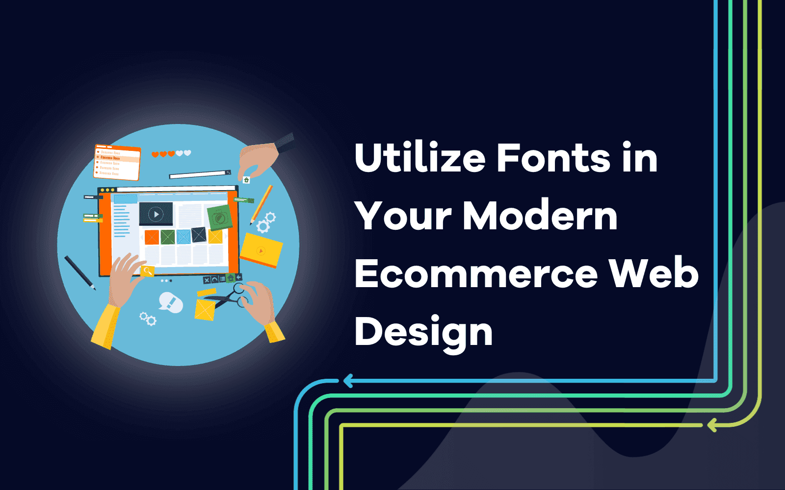
Utilize Fonts in Your Modern Ecommerce Web Design
Last updated on Thursday, September 14, 2023
In the bustling bazaar of the digital age, ecommerce platforms stand as modern storefronts, inviting visitors from across the globe.
But what beckons these visitors, making them linger, explore, and eventually, make a purchase? Beyond the products and visuals, there's an unsung hero crafting the ambiance of this digital marketplace: typography.
Fonts, often overlooked, are the silent narrators of the ecommerce tale. They're not just letters on a screen; they're the voice, the mood, the personality of a brand.
In the split second world of online shopping, where first impressions can make or break a sale, the choice of typography becomes paramount. It's the difference between a fleeting glance and an engaged visitor.
As we delve deeper into the world of modern ecommerce web design, let's shine a spotlight on the role of fonts. Let's explore how they shape experiences, evoke emotions, and ultimately, play a pivotal role in the success of your digital storefront.
The Silent Symphony of Typography
Among these, there's a subtle instrument, often overlooked, yet profoundly impactful: typography. It's the silent symphony that resonates in the background, setting the tone, mood, and rhythm of our online journeys.
Imagine, for a moment, an ecommerce site without words. Even if the visuals are striking, it's the text that guides, informs, and persuades. And how is that text presented? That's where the magic of typography comes into play. Fonts aren't just carriers of messages, they're storytellers. Each typeface, with its unique curves, edges, and spaces, whispers tales of elegance, boldness, nostalgia, or innovation.
In the realm of ecommerce, where split second decisions are made, and impressions are formed in the blink of an eye, typography becomes even more crucial. It's not just about legibility, it's about emotion. The right font can evoke trust, excitement, or comfort, subtly nudging the visitor towards making a purchase.
So, as we navigate the bustling marketplace of the internet, let's pause and listen to this silent symphony. Let's unveil the unspoken power of typography, recognizing its pivotal role in shaping the ecommerce tapestry. For in the dance of pixels and colors, fonts move gracefully, leaving an indelible mark on our digital experiences.
Fonts as Emotional Storytellers
Typefaces are more than just letters on a screen, they're the silent narrators of the stories we wish to tell, the emotions we aim to evoke.
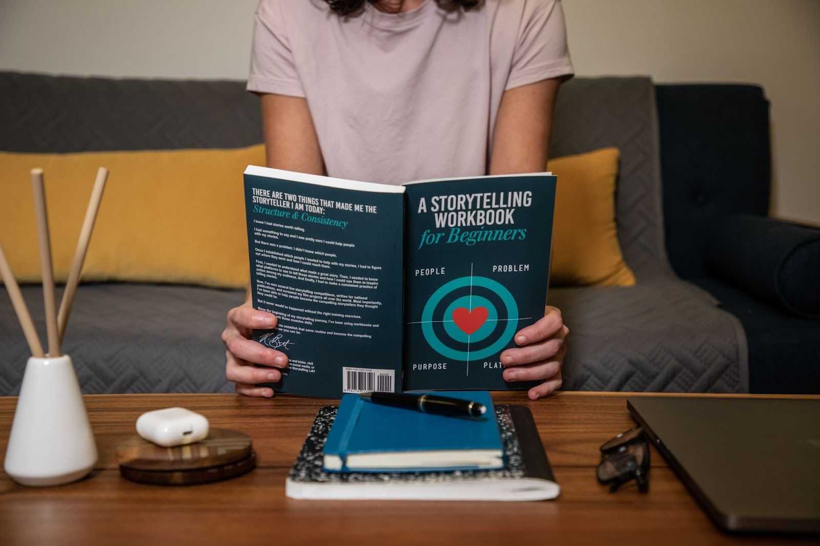
Consider the elegant swirls of a script font, reminiscent of handwritten letters from a bygone era. It doesn't just convey words it sings songs of nostalgia, romance, and personal touch. On the other hand, the clean lines of a modern sans serif might echo the principles of minimalism, efficiency, and forward thinking.
The beauty of fonts lies in their versatility. They can shout or whisper, laugh or cry, dance or stand still. And while our conscious minds read the words, our subconscious is busy interpreting the emotions, the undertones carried by the choice of typeface. It's a subtle dance of psychology and design, where fonts have the power to make us feel seen, understood, and connected.
So, the next time you come across a piece of text online, pause for a moment. Listen to the silent stories being told by the fonts. Dive deep into the psychology behind those typefaces and realize how they're not just speaking to your mind, but whispering to the very depths of your soul.
The Typeface Palette: Picking Your Heroes
In the bustling streets of the digital metropolis, every ecommerce site is like a unique storefront, each vying for the attention of passersby. And just as a store owner carefully selects the colors and decor of their shop, so too must the digital curator choose the right fonts for their online space. It's akin to picking the heroes of your story, the champions that will represent your brand's voice.

Now, if you've ever worked with a web design agency, you'd know the weight of the question: Serif or Sans Serif?
It's like choosing between the classic charm of brownstone buildings and the sleek modernity of glass skyscrapers. Each has its own allure, its own narrative. This is often different as many agencies have different web development process and many of them strive to integrate what their team uses the most often.
Then there's the debate between Display and Decorative fonts. These are the statement pieces, the bold murals on brick walls, or the neon signs that light up the night. They're not just typefaces, they're conversation starters.
Choosing the right fonts for your digital storefront isn't just a technical decision it's an art form. It's about understanding the essence of your brand, the emotions you want to evoke, and the stories you wish to tell. And in a city as vibrant and diverse as the digital landscape, having the right heroes – the perfect typefaces – can make all the difference.
Harmonizing Fonts: The Duet of Design
In the grand concert of web design, where every element plays its distinct note, fonts often come forward as duets. Their harmonies, when struck right, can elevate the entire composition, turning a simple webpage into a symphonic experience.

Imagine two voices, distinct yet complementary. One might be bold and assertive, like the lead singer belting out the chorus, while the other offers a gentle undertone, providing depth and nuance. This is the art of font pairing. It's not just about choosing two beautiful typefaces, it's about finding ones that, when combined, sing in perfect harmony.
The principles of pairing fonts are much like the rules of a well composed song. There's rhythm, balance, and contrast. A tall, elegant serif might be paired with a grounded, straightforward sans serif, creating a balance that's both visually appealing and emotionally resonant.
But beyond the principles, there's poetry. It's in the subtle dance of a headline font with its supporting text, the way they play off each other, creating a cohesive visual narrative that guides the reader's journey.
So, as we craft our digital stories, let's not forget the duets. For in the harmonizing of fonts, we find the soulful melodies that make our designs truly sing. This is very helpful in numerous marketing tactics and it can be integrated in lead generation as well.
Typography in the Palm of Your Hand

In a world where horizons have shifted and screens have shrunk, our stories are now often told in the confines of handheld devices. The vast canvases of desktop monitors have given way to the compact, everpresent mobile screens. And in this intimate, mobilefirst realm, typography takes on a new dance, a ballet of adaptability and precision.
Imagine the challenge: conveying the same emotion, the same message, but on a stage that's a fraction of the size. It's like trying to paint a masterpiece on a postage stamp. Fonts that once soared on larger screens might feel cramped or lost on mobile. Yet, this is the stage where most of the modern world shops, interacts, and connects.
But where there are challenges, there are also opportunities. The mobile world, with its swipes and taps, offers a closeness, an immediacy. Typography here isn't just about being legible it's about being felt. It's about ensuring that every word, every letter, resonates in the palm of the user's hand, creating experiences that are both tactile and emotional.
As we navigate this mobilefirst shopping landscape, it's essential to see it not as a limitation, but as a new canvas. A space where typography, with all its nuances and subtleties, can truly shine, making the digital feel personal, right at our fingertips.
Dodging the Typography Traps

In the intricate dance of ecommerce design, where every element pirouettes for the user's attention, typography often takes center stage. But like any performance, missteps can be costly. And in the world of fonts, these missteps can quickly turn a graceful ballet into a clumsy stumble.
Imagine setting the table for a grand feast. Each piece of cutlery, each plate, and glass has its place. Now, imagine crowding that table with too many dishes, overwhelming the senses. That's what happens when we overload a design with too many typefaces. The visual clutter can confuse, distract, and even repel visitors.
Then there's the trap of choosing style over substance. A font might look avantgarde or whimsical, but if it sacrifices readability, it's like a beautiful shoe that's too tight to walk in. The aesthetic appeal fades quickly when users struggle to decipher product descriptions or CTAs.
And let's not forget the importance of contrast. A font might be perfectly legible on a white background, but place it against a pattern or a darker shade, and it might vanish like a shadow in the night.
Navigating the world of ecommerce typography is a journey filled with choices. But by being aware of the traps and pitfalls, we can chart a course towards a harmonious font ensemble, one that not only looks good but feels right, guiding users seamlessly through the digital marketplace.
Your Font Toolbox: Brushes for the Digital Canvas
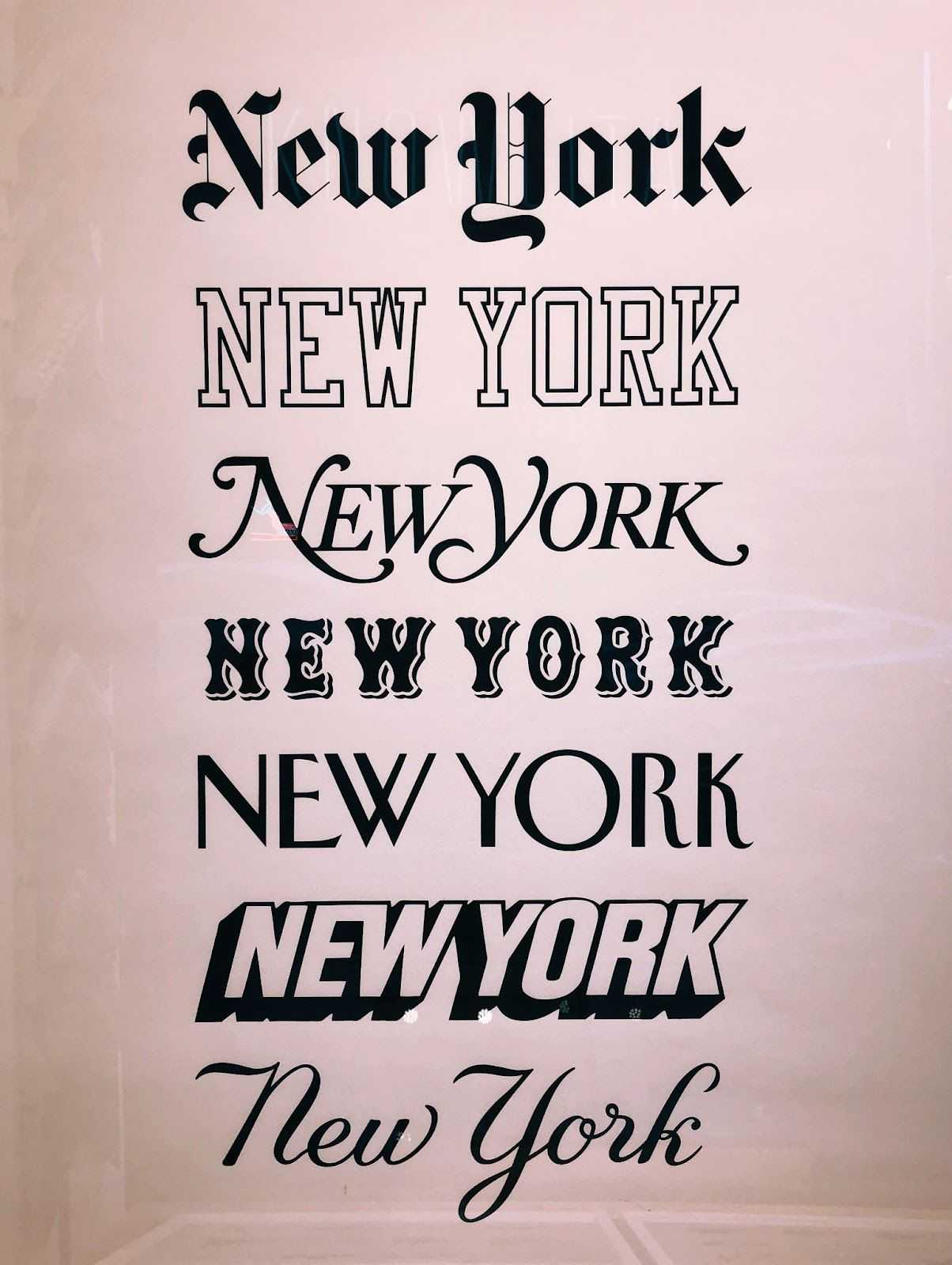
In the grand studio of web design, where the digital canvas stretches out, waiting for stories to unfold, fonts emerge as the brushes of choice. They're not just tools they're extensions of the artist's hand, each bringing its own flair, its own emotion to the masterpiece.
But just as a painter wouldn't rely on a single brush, a web designer's arsenal is filled with a myriad of typefaces, each suited for a specific stroke, a particular mood. The challenge? Finding the right brushes for your unique canvas, the ones that help your ecommerce tale come alive with vibrancy and depth.
Enter the font toolbox, a treasure trove curated with precision and care. It's not just a collection it's a palette of possibilities. From tools that help you pair fonts harmoniously to libraries brimming with typefaces waiting to be discovered, this toolbox is the compass guiding designers through the vast seas of typography. It is extremely useful to integrate various strategies that incorporate essential typography features to lure new customers and create a recognizable brand perspective, to achieve this you may utilize the power of agencies like Link Gathering.
Whether you're looking to pen a bold headline, craft a delicate product description, or weave a narrative that resonates, the right tools are at your fingertips. And with them, the power to paint your ecommerce story in hues and tones that captivate, inspire, and engage.
The Last Word: Fonts as the Soul of Ecommerce
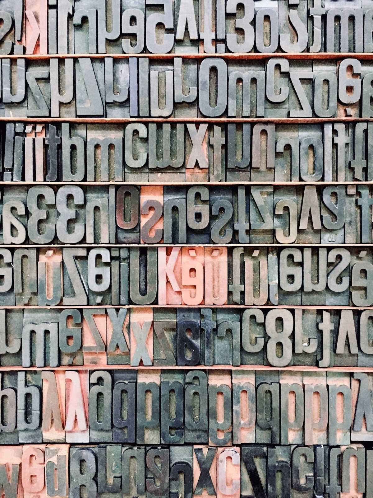
In the vast theater of ecommerce, where products take the spotlight and visuals set the stage, there's an unsung hero that breathes life into every performance: typography. It's the whispered dialogue, the silent soliloquy that speaks directly to the heart of the audience.
Imagine an opera without arias, a play without monologues. That's an ecommerce platform without thoughtfully chosen fonts. They might seem like mere details, background actors in the grand scheme of things. But in reality, they're the soul, the essence that gives depth to the narrative.
Each typeface carries with it a legacy, a personality. The bold assertiveness of a headline font, the gentle caress of a script used for testimonials, the straightforward honesty of the font detailing product specifications – each plays its part in telling your brand's story.
As we draw the curtains on our discussion of ecommerce typography, it's vital to remember that fonts aren't just characters on a screen. They're the voice, the emotion, the very soul of your digital storefront. And in this ever evolving world of online shopping, ensuring that your brand's soul resonates with clarity and authenticity can make all the difference.

Article by:
Kevin Donvas
SEO Manager
Kevin Donvas is a seasoned SEO Manager and Link Builder hailing from the bustling city of Chicago. With half a decade of experience under his belt, Kevin has carved a niche for himself in tech-related sectors, leveraging his expertise to drive organic growth and enhance online visibility. His deep understanding of search engine optimization, combined with a passion for technology, positions him as a go-to professional in digital marketing. When he's not optimizing websites or building authoritative links, Kevin enjoys exploring the latest tech trends and innovations that shape the digital world.
